The Psychology of Shades
Color is one of the most powerful tools in interior design. It influences our mood, perception of space, and even our energy levels without us consciously realizing it. Understanding the subtle language of different shades is key to selecting the ideal palette for your living environment.
A. Mood and Emotion:
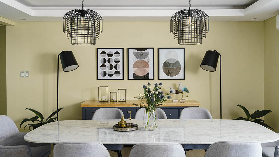
- Warm Colors (Reds, Oranges, Yellows): These evoke feelings of energy, warmth, and passion. Reds can stimulate appetite and conversation, making them popular in dining areas. Yellows bring cheerfulness and optimism, often used in kitchens or sunny rooms. Oranges are vibrant and creative.
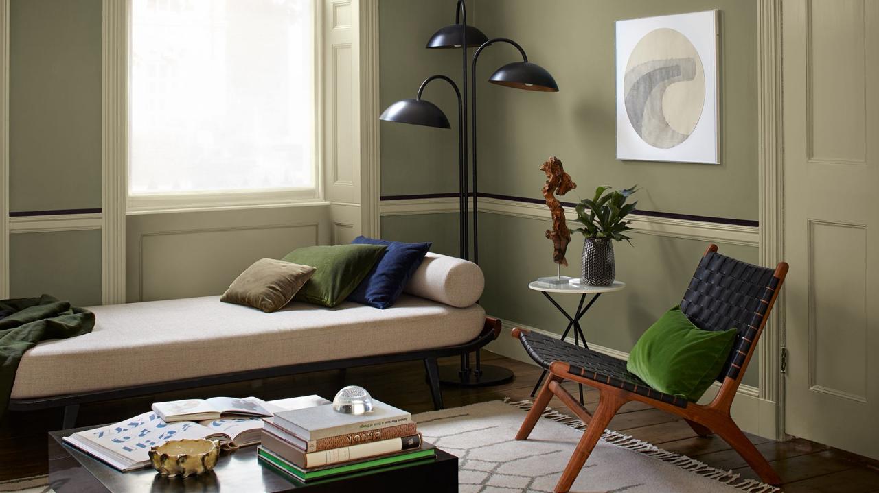
- Cool Colors (Blues, Greens, Purples): These induce calm, tranquility, and a sense of serenity. Blues are known for their calming effect, ideal for bedrooms or bathrooms. Greens evoke nature, freshness, and balance, excellent for living rooms or home offices. Purples can be luxurious and mysterious, used for accent or in more formal spaces.
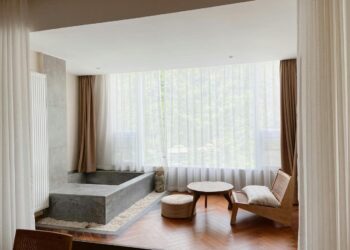
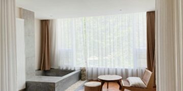
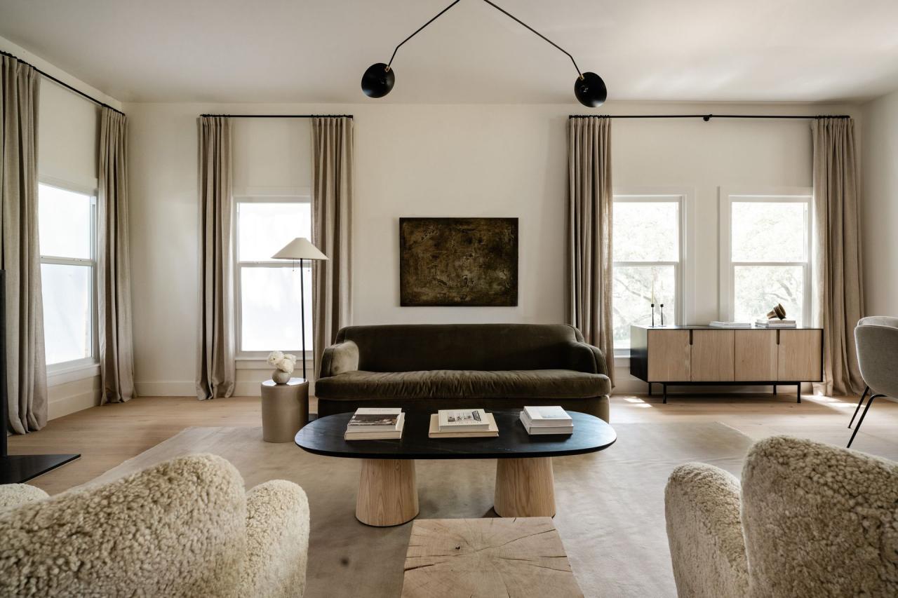
- Neutrals (Whites, Grays, Beiges, Browns): These provide a stable, grounding backdrop. They are versatile, sophisticated, and create a sense of spaciousness and clarity. They allow other elements (furniture, artwork, textiles) to truly shine.
B. Perception of Space:
- Light Colors: Tend to make rooms feel larger, more open, and airier by reflecting light. They are excellent for smaller spaces or rooms with limited natural light.
- Dark Colors: Can make a room feel cozier, more intimate, and dramatic. They absorb light, so they work best in larger rooms with ample natural light, or as accent walls to create depth.
- Ceiling Colors: Painting ceilings lighter than walls can make a room feel taller. Painting them darker can create intimacy and lower the perceived height.
C. Visual Weight and Balance:
- Saturated Colors: Have more visual weight and can draw attention. Use them strategically as accents.
- Muted Colors: Are less visually demanding and can be used on larger surfaces without overwhelming the space.
- Harmonious Flow: A well-chosen color palette creates a cohesive flow between rooms, making the entire home feel integrated and thoughtful.
Unpacking Timeless Neutral Colors
When we speak of timeless hues, we often begin with the power of neutrals. These colors are the workhorses of interior design, providing a versatile and elegant base upon which any personal style can be built.
A. Classic Whites:
- Versatility: Whites are arguably the most versatile of all colors. They reflect light, making spaces feel larger, brighter, and cleaner.
- Shades of White: Not all whites are created equal. They range from cool, stark whites with blue or gray undertones to warm, creamy whites with yellow or pink undertones. Choosing the right white depends on the natural light of the room and the desired mood.
- Perfect Backdrop: White walls act as a pristine canvas, allowing furniture, artwork, and vibrant textiles to pop. They are ideal for minimalist aesthetics or for showcasing bold decorative elements.
- Examples: Off-white, Alabaster, Dove White, Cream.
B. Elegant Grays:
- Sophistication: Gray has emerged as a dominant neutral, offering a contemporary yet timeless sophistication. It bridges the gap between classic and modern.
- Range of Tones: Grays span a spectrum from cool, steely shades to warm, greige (gray-beige) tones. Lighter grays can make a room feel serene and expansive, while darker charcoals can create drama and intimacy.
- Complementary: Gray pairs beautifully with almost any accent color, from vibrant yellows to deep blues or earthy greens, making it incredibly adaptable.
- Examples: Light Gray, Charcoal, Greige, Stone Gray, Pewter.
C. Warm Beiges and Taupes:
- Comfort and Warmth: Unlike the often cool perception of grays, beiges and taupes (a mix of gray and brown) exude warmth, comfort, and an inviting ambiance. They create a cozy, grounded feeling.
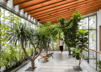
- Natural Appeal: These colors are often found in natural materials like wood and sand, bringing an organic, earthy feel to interiors.
- Understated Elegance: They offer a subtle sophistication that avoids being stark, providing a soft backdrop that never goes out of style.
- Examples: Sand, Khaki, Fawn, Mushroom, Creamy Beige.
D. Earthy Browns:
- Grounded and Rich: Browns, especially richer tones like chocolate or deep caramel, provide a sense of grounding, stability, and natural richness.
- Textural Play: They work beautifully with textures like wood, leather, and natural fibers, enhancing a cozy, layered look.
- Accent or Dominant: While often used in furniture or flooring, lighter browns can also work as wall colors to create a warm, inviting atmosphere.
- Examples: Tan, Espresso, Walnut, Terracotta, Burnt Umber.
Strategic Splashes of Sophistication
While neutrals form the backbone of a timeless home, carefully chosen accent colors can inject personality, depth, and sophistication without succumbing to fleeting trends. These are not loud, but rather subtle and rich hues that have a long history in design.
A. Deep Blues:
- Serenity and Depth: From muted navy to a rich, inky midnight blue, these shades evoke calmness, stability, and depth. They are particularly effective in bedrooms, studies, or elegant living rooms.
- Versatility: Deep blues pair beautifully with whites, grays, and natural wood tones, creating a classic and sophisticated scheme. They can also provide a stunning contrast to warm metallic accents.
- Examples: Navy, Sapphire, Cadet Blue, Indigo.
B. Soft Greens:
- Nature and Tranquility: Greens, especially muted and earthy tones, bring the calming influence of nature indoors. They create a sense of freshness, growth, and relaxation.
- Adaptability: Sage green, olive green, or muted moss green work wonderfully in almost any room, from kitchens to bathrooms, and are excellent for promoting well-being.
- Harmonious: They blend seamlessly with other natural elements and materials, reinforcing a serene aesthetic.
- Examples: Sage, Olive, Forest Green, Moss Green.
C. Muted Terracottas and Rusts:
- Earthy Warmth: These are warm, inviting tones with an organic, rustic appeal. They evoke the warmth of natural clay and the rich hues of autumn.
- Mediterranean/Bohemian Vibe: They can bring a touch of old-world charm or a relaxed, bohemian feel, especially when paired with natural textures and materials.
- Accent Power: Best used as accent walls, in textiles, or through pottery and decorative objects to add warmth without overwhelming.
- Examples: Clay, Burnt Orange, Rust, Sienna.
D. Classic Blacks:
- Drama and Definition: Used strategically, black can provide dramatic contrast, define spaces, and add a touch of modern sophistication.
- Architectural Elements: Often effective on trim, doors, window frames, or as an accent wall to ground a space.
- Balancing Act: Too much black can feel heavy, so it requires careful consideration and balance with lighter colors.
- Examples: Matte Black, Charcoal Black, Soot.
The Art of Application
Once you’ve selected your palette, the way you apply these colors is just as crucial to achieving a timeless and sophisticated look.
A. Start with a Neutral Canvas:
- Walls and Large Surfaces: Begin by painting the largest surfaces (walls, ceilings) in your chosen neutral shade. This creates the foundational calm and spaciousness.
- Major Furniture: Consider purchasing large furniture pieces (sofas, armchairs) in neutral fabrics. They are significant investments and will serve as versatile elements for years.
B. Layering Textures and Materials:
- Add Depth: Neutrals come alive with texture. Incorporate varying textures through textiles (wool rugs, linen curtains, velvet cushions), wood finishes (light, dark, distressed), metal accents (brass, matte black, chrome), and stone elements.
- Organic Elements: Bring in natural materials like plants, fresh flowers, woven baskets, and ceramic pottery to add warmth and life.
C. Thoughtful Accent Placement:
- Small Doses: Introduce your chosen accent colors in smaller, easily changeable elements: throw pillows, blankets, decorative vases, books, or a piece of artwork.
- Visual Interest: Use accents to create focal points or to tie different areas of an open-plan space together.
- Consider Flow: Ensure your accent colors complement the overall neutral palette and flow seamlessly from one room to another, creating visual harmony.
D. The Power of Natural Light:
- Color Perception: Natural light drastically changes how colors appear throughout the day. Always test paint swatches on your walls in different lighting conditions (morning, noon, evening) before committing.
- Sheer vs. Heavy Drapes: Use window treatments that allow ample natural light to flood the room, especially for lighter color schemes.
E. Don’t Forget the Fifth Wall (Ceiling):
- White as Standard: A crisp white ceiling is standard and helps reflect light, making rooms feel taller.
- Subtle Tint: For a cozier feel, consider painting the ceiling a slightly lighter tint of your wall color, or a very pale neutral.
- Dark Drama: In larger, more dramatic spaces, a darker, rich ceiling color can create a unique, intimate atmosphere.
Avoiding Common Color Pitfalls for Timeless Design
While aiming for timelessness, it’s easy to fall into traps that can undermine your efforts or lead to a generic outcome.
A. Chasing Every Trend:
- Fad Fatigue: Constantly redecorating to follow every fleeting trend is expensive and exhausting. Your home will always feel a step behind.
- Incoherent Style: A medley of clashing trends results in a disjointed, unharmonious space rather than a curated one.
B. Over-Using Bold Colors:
- Overwhelm: While a pop of color is great, painting an entire room in a very bright or saturated hue can quickly become overwhelming and tiresome.
- Limits Versatility: A dominant, bold color restricts future changes to furniture or decor, as everything must coordinate with that strong base.
C. Ignoring Natural Light and Room Orientation:
- Wrong Undertones: A cool gray might look beautiful in a south-facing room but appear sterile and cold in a north-facing room with limited warm light.
- Testing is Key: Never choose a paint color from a tiny swatch or online image. Always get samples and paint large swatches on your walls to see how the color behaves throughout the day.
D. Neglecting the “Flow” Between Rooms:
- Abrupt Transitions: Having wildly different color schemes in adjacent rooms can make a home feel disjointed and less cohesive.
- Subtle Harmony: Aim for a subtle progression of color, or stick to a consistent neutral palette that allows for smooth transitions.
E. Forgetting Your Personal Style:
- Generic Looks: While aiming for timelessness, ensure your choices still reflect your personality and preferences. A timeless home is not a sterile showroom.
- Meaningful Objects: Incorporate personal photos, collected items, and artwork that tell your story and add warmth and individuality.
Conclusion
Choosing the best color for your home is an investment in creating a space that nurtures, inspires, and endures. By understanding the psychology of shades and embracing the power of timeless hues, you can craft an environment that feels both classic and contemporary, sophisticated and deeply personal.
The focus on versatile neutrals — whites, grays, beiges, and browns — provides an elegant and calming foundation. These are the unsung heroes that allow your furniture, artwork, and personal touches to truly shine. Thoughtful splashes of enduring accent colors like deep blues, soft greens, and earthy terracottas can then be layered in, adding depth and character without committing to fleeting trends.
Ultimately, a truly well-colored home is a harmonious symphony of shades, textures, and personal elements. It’s a space that doesn’t scream for attention but quietly impresses with its comfort, balance, and enduring style. By making intentional color choices, you are not just painting walls; you are painting the backdrop for years of cherished memories, creating an effortless and beautiful sanctuary that stands the test of time.]